One brand, from gangway to interface
The living style guide for Crew2Sea: logo, colour, typography, interface elements and imagery. Everything on this page is the single source of truth for how the platform looks and feels.
Logo
The wordmark
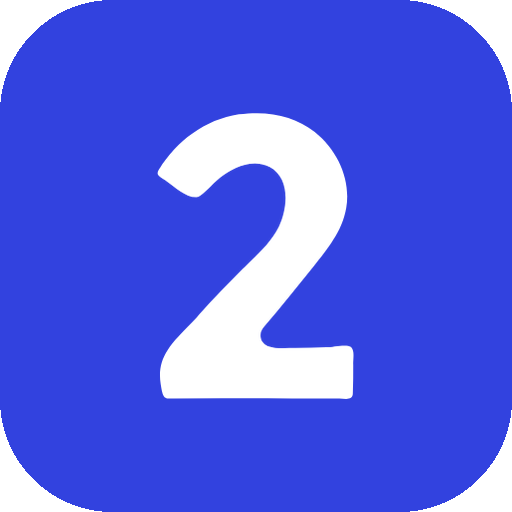
One wordmark, two versions. There is no separate symbol: the blue two doubles as the app icon.


On dark surfaces the letters go white and the accent lightens to #8b95ff. The original #3243df only reaches 2.7:1 on navy, which is unreadable, so this is a deliberate second version and not a recolour.
Logo
The mark
The two on its own, for favicons, app icons and avatars.


- Full colour on white and light surfaces, the light version on navy.
- Clear space around the wordmark: at least the height of the letter c.
- Never stretch, rotate, outline or add effects.
- Only the two may be used on its own, never a single letter.
Colour
Indigo does the talking, status colours do the work
Brand blue
#3243df
The logo. Sits in the same family as the Agensea indigo.
Brand blue light
#8b95ff
The logo and brand accents on dark surfaces.
Indigo
#2d3fe0
The Agensea accent. Links, active states and primary surfaces.
Ocean 600
#2d6fa8
Buttons and any surface carrying white text. Passes AA at 5.3:1.
Ink black
#0d0d0d
Darkest surfaces, footer, cinematic sections.
Ink 900
#171717
Primary buttons and headings on light.
Indigo 400
#6c7bf5
Brand gradients and highlights.
Indigo 300
#b3bafa
Soft accents and eyebrow text on dark.
Violet
#6c63ff
Secondary accent, gradient endings.
Cream
#faf9f6
The Agensea canvas. Cards sit on white on top of it.
Ok / Committed
#1c7a58
Warn / Expiring
#8a6413
Alert / Urgent
#a8433b
Verified
#2d3fe0
Crew2Sea is built on the Agensea house style, so it reads as a branch of the same family: cream canvas, indigo accent, ink black for depth. Marketing starts on indigo and sweeps to cream while you scroll. Status colours are reserved for meaning, never for decoration.
Typography
Outfit speaks, Inter works
Display, Outfit
Crew that shows up.
Semibold 600 for every heading
Tight tracking, short lines, max 3 lines per heading. Also used for numbers, scores and labels in caps with wide letter spacing.
Body and UI, Inter
Calm, legible and efficient. Medium 500 for interface labels, regular 400 for running text. Body copy stays around 1rem with a relaxed line height, muted grey for supporting text.
Interface elements
Pills, cards and honest numbers
Buttons
Always fully rounded. One primary action per view. Navy on light surfaces, ocean for accents on dark or blue.
Status model
Neutral chips with a coloured dot: colour carries meaning without loud fills. The four placement statuses keep these exact colours everywhere.
Match score
Green from 85, amber from 60, red below. Scores always come with a breakdown, never as a bare number.
Motion principles
Backgrounds sweep from brand blue to white while scrolling, never as a static gradient.
Scores and bars fill up when they enter the viewport, once.
Sections reveal with a soft 22px rise, staggered per card.
Respect prefers-reduced-motion: everything stays readable without animation.
Imagery
Bright sea, real work
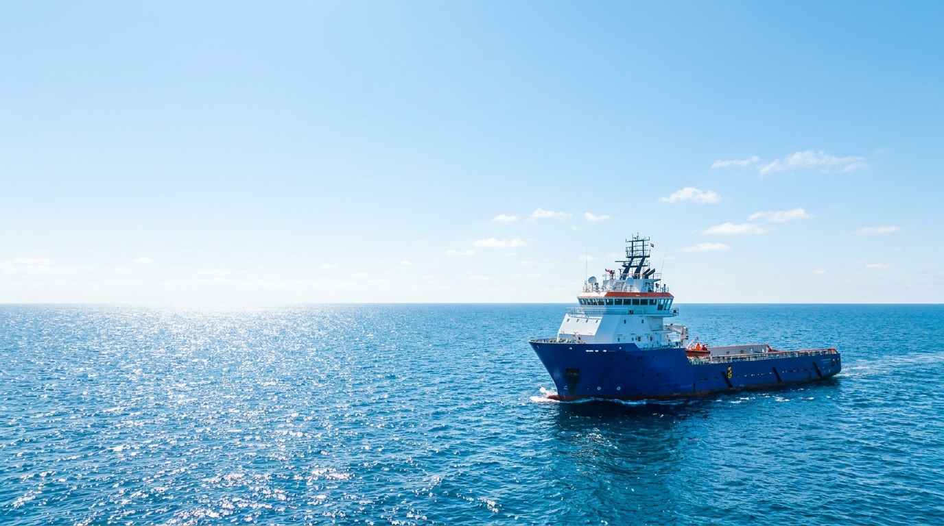
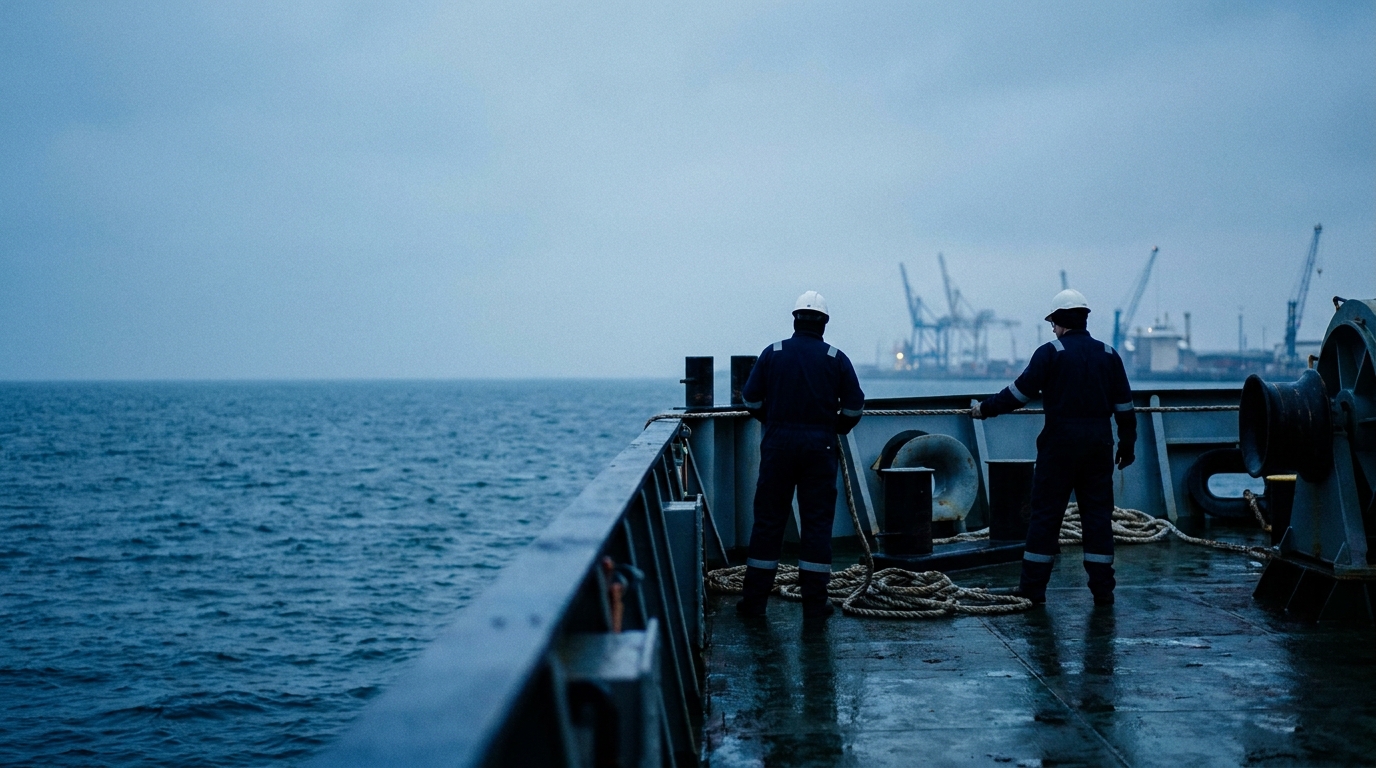
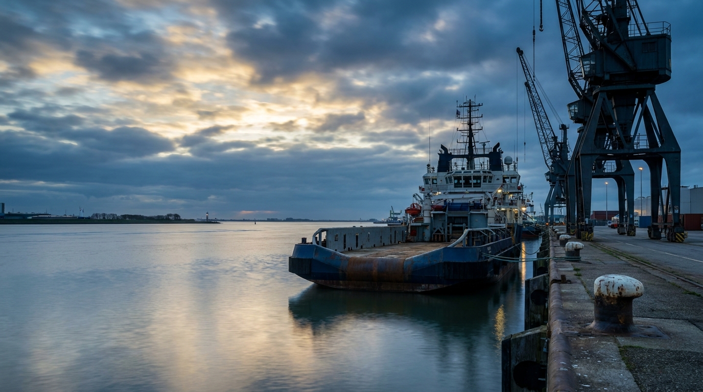
Fresh daylight, vivid blues, working vessels and harbours. No black and white, no stocky handshakes, no recognizable faces. Video is ambient and slow: the sea moves, the camera barely does.
Assets
Logo files
Transparent PNG, current versions. Vector set follows with the final logo.